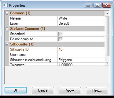

The Properties Pane and the Properties of Selected Dialog both display data using a Property Grid. A property grid is a hierarchical list of properties (many are editable) and is capable of displaying many different data types or sub-items consistently.

Property grids are comprised of data panels (i.e. a “Common” section and other object type sections depending on what is selected), a hyperlink panel, and a help panel.
• The data panel(s) contains the property data of selected items. The Common section contains the properties that are common to all selected objects, which generally are the Material and Layer properties. Below the common area are the properties specific to the objects selected, separated by headings for each type. The property fields will show data applicable to the selected item. If multiple items are selected and they share the same property, the field will show the common property. If multiple items are selected and they have differing properties, the field will show “varies”. Note that if you edit a “varies” field, the change will apply to all selected items.
• The hyperlink panel shows text that can be clicked that cause various actions (text is known as a hyperlink, and works similarly to web browsers). When certain property fields are clicked and selected, a hyperlink will appear in this area providing quick access to relevant areas of the application. For example, when the Material property is selected an “Open project materials dialog” hyperlink appears and when clicked the Materials Dialog is opened.
• The help panel shows a brief description of the selected property. For example, if the Material property is selected, the help panel shows “Material – The material (i.e. color or photo-texture) used when rendering”.
The various components of the property grid can be expanded or contracted by clicking the small “+” (when contracted) or the “-“ (when expanded) next to the panel heading. Double clicking the panel heading toggles the panel contracted or expanded.
Panels can also be sized. When placing the mouse cursor over the border of the panel, the cursor changes to a sizing cursor which enables you to click and drag the panel border.
The grid shows various data types:
• check boxes for true (checked) or false (unchecked) properties.
• text properties like names
• numerical, for value properties
• dropdowns for properties with a preset list of options.
• where appropriate the units of the property is shown
Properties shown in red text can be edited in the grid. To edit a value, click on the property to select it, then click on the edit variable field hyperlink in the hyperlink panel. The field can then be edited as required. After a property is edited, the change takes effect once you select another property, hit enter on the keyboard or click on another window or pain. Hitting Esc on the keyboard while editing will cancel the change.